The Role of Colour in Brand Psychology
Colour and Emotion
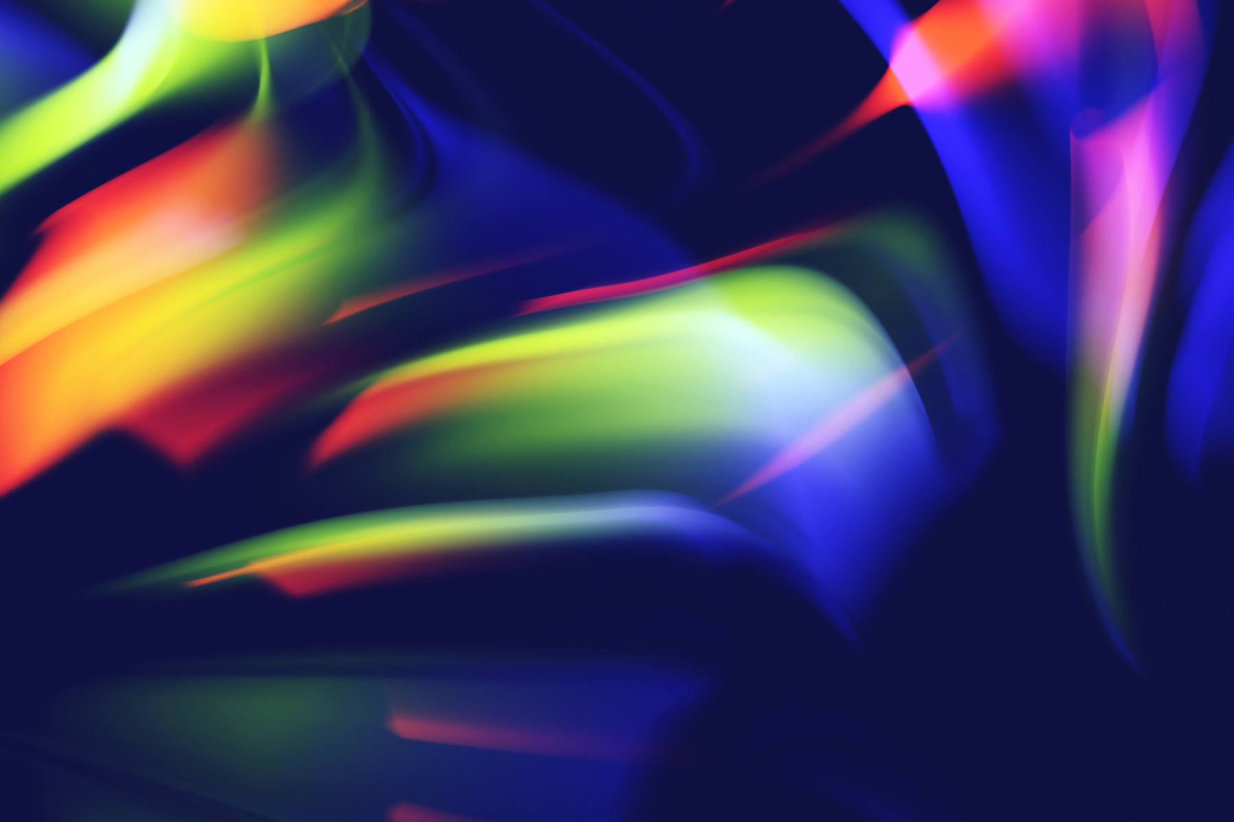
Imagine a world without colours – it would be a monochrome existence devoid of vibrancy and emotions. Colours are deeply intertwined with our feelings and experiences. From the calming embrace of blues to the passionate embrace of reds, each colour resonates with distinct emotions. Brands harness this emotional language to communicate their identity and values.
- Red: Bold and attention-grabbing, red symbolises energy, passion, and urgency. Brands like Coca-Cola use this colour to evoke excitement and stimulate appetite.
- Blue: Trust, stability, and calmness characterise the colour blue. Brands like IBM employ it to project professionalism and reliability.
- Green: Associated with nature and growth, green signifies freshness and harmony. Brands in the health and organic sectors often adopt green to convey wellness.
- Yellow: A burst of positivity and optimism, yellow captures attention and radiates warmth. Brands like McDonald's use it to signify happiness and playfulness.
- Black: Elegance, sophistication, and authority emanate from black. Luxury brands often embrace black to exude exclusivity.
- Purple: A blend of stability and creativity, purple sparks a sense of luxury and imagination. It's a favourite among beauty and cosmetic brands.
The Science of Colour Perception
Colour perception isn't just about aesthetics – it's rooted in science. Our brains respond to colours based on their wavelengths, triggering emotional and physiological reactions. Warm colours like red and yellow are associated with increased heart rate and appetite, while cooler coolers like blue and green promote relaxation.
Cultural Influences on Color
Colours aren't universally perceived in the same way across cultures. Different cultures attach diverse meanings to colours based on historical, religious, and societal contexts. Brands operating in global markets must be mindful of these cultural nuances to avoid unintended misinterpretations.
Colour Consistency Builds Brand Identity
Consistency in colour usage is essential for building a strong brand identity. Over time, consumers associate certain colours with specific brands. This phenomenon, known as colour memory, enhances brand recognition and reinforces a brand's presence.
Strategic Colour Choices
Choosing colours isn't a random process – it's a strategic decision. Brands consider their target audience, industry norms, and competitive landscape when selecting colours. For example, a financial institution might opt for blue to convey trustworthiness, while a youth-oriented brand might embrace vibrant colours for a playful vibe.
Colour is an art, a science, and a language rolled into one. It's a silent communicator that bridges the gap between brands and consumers. Understanding the psychology of colour empowers brands to influence emotions, establish identity, and foster meaningful connections. So, the next time you encounter a logo, a website, or a product packaging, remember that the colours you see are more than pigments – they're the keys to unlocking a world of emotions and associations, shaping your perceptions in ways both subtle and profound.
Colour and Emotion
Imagine a world without colours – it would be a monochrome existence devoid of vibrancy and emotions. Colours are deeply intertwined with our feelings and experiences. From the calming embrace of blues to the passionate embrace of reds, each colour resonates with distinct emotions. Brands harness this emotional language to communicate their identity and values.
- Red: Bold and attention-grabbing, red symbolises energy, passion, and urgency. Brands like Coca-Cola use this colour to evoke excitement and stimulate appetite.
- Blue: Trust, stability, and calmness characterise the colour blue. Brands like IBM employ it to project professionalism and reliability.
- Green: Associated with nature and growth, green signifies freshness and harmony. Brands in the health and organic sectors often adopt green to convey wellness.
- Yellow: A burst of positivity and optimism, yellow captures attention and radiates warmth. Brands like McDonald's use it to signify happiness and playfulness.
- Black: Elegance, sophistication, and authority emanate from black. Luxury brands often embrace black to exude exclusivity.
- Purple: A blend of stability and creativity, purple sparks a sense of luxury and imagination. It's a favourite among beauty and cosmetic brands.
The Science of Colour Perception
Colour perception isn't just about aesthetics – it's rooted in science. Our brains respond to colours based on their wavelengths, triggering emotional and physiological reactions. Warm colours like red and yellow are associated with increased heart rate and appetite, while cooler coolers like blue and green promote relaxation.
Cultural Influences on Color
Colours aren't universally perceived in the same way across cultures. Different cultures attach diverse meanings to colours based on historical, religious, and societal contexts. Brands operating in global markets must be mindful of these cultural nuances to avoid unintended misinterpretations.
Colour Consistency Builds Brand Identity
Consistency in colour usage is essential for building a strong brand identity. Over time, consumers associate certain colours with specific brands. This phenomenon, known as colour memory, enhances brand recognition and reinforces a brand's presence.
Strategic Colour Choices
Choosing colours isn't a random process – it's a strategic decision. Brands consider their target audience, industry norms, and competitive landscape when selecting colours. For example, a financial institution might opt for blue to convey trustworthiness, while a youth-oriented brand might embrace vibrant colours for a playful vibe.
Colour is an art, a science, and a language rolled into one. It's a silent communicator that bridges the gap between brands and consumers. Understanding the psychology of colour empowers brands to influence emotions, establish identity, and foster meaningful connections. So, the next time you encounter a logo, a website, or a product packaging, remember that the colours you see are more than pigments – they're the keys to unlocking a world of emotions and associations, shaping your perceptions in ways both subtle and profound.
Related Insights